
Most hobbyists who shoot sharp colour images have converted a favourite file to black and white at some point and felt it go flat.
Often the file is fine. The bird simply relied on colour to hold the picture together, and removing colour removed the structure.
Some birds carry their character in tone, texture and the shape of the light on them.
Those are the birds that make strong black and white bird portraits, and you can learn to spot them before you raise the camera.
This guide is a decision process for the portrait itself: which bird, in which light, against which background, is worth making monochrome.
Colour hides weak tonal structure, and monochrome exposes it
In a colour image, hue does a lot of the separating.
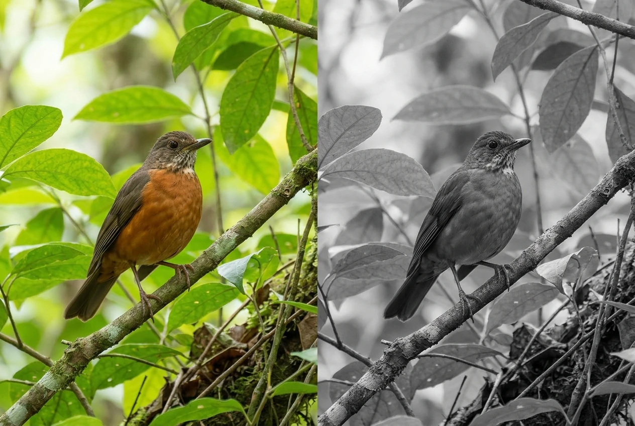
A rusty breast against green leaves reads clearly because orange and green are different colours.
Convert that file and the two can land at nearly the same grey, so the bird sinks into its surroundings.
The same happens with a blue-grey bird against a blue-grey sky, or a brown thrush against brown reeds.
Monochrome leaves you three tools: luminance (how light or dark each area is), texture, and the direction of the light.
A bird works in black and white when it brings at least two of these without help from colour.
Good candidates tend to share some traits:
- Strong plumage patterning in light and dark. Barred, streaked, spotted or two-tone birds such as owls, raptors, herons, egrets, avocets and gulls give you built-in tonal contrast.
- Fine feather texture. Soft, layered feathers on an owl’s facial disc or the hackles of an eagle show up in the grey tones when side light grazes them.
- A clear tonal difference between head and body, or between bird and perch.
Weaker candidates are birds whose appeal is chromatic.
Iridescence changes with viewing angle, and in monochrome a glowing gorget can turn into a dull dark patch.
A bird that is evenly mid-tone, in flat light, against a mid-tone background, has almost nothing to work with.
That does not make the species a bad subject. It means that particular frame belongs in colour.
Reading a bird’s tonal map: plumage luminance, the eye and the beak
A tonal map is your mental picture of how the scene will look as greys. Build it from three parts.
Plumage luminance
Sort the bird’s plumage into rough zones: near-white, light grey, mid-grey, dark, near-black.
Then ask where the transitions fall.
Hard transitions, like the white breast and black cap of a chickadee or the white head and dark body of a bald eagle, give you graphic shape.
Soft transitions, like a gradual fade from buff to brown, give you subtlety and need good light to show.
Check the total range, too.
A white egret and a black cormorant sit at opposite ends of the scale, and both are harder to expose than a mid-tone bird because the detail you care about lives close to a clipping point.
The eye
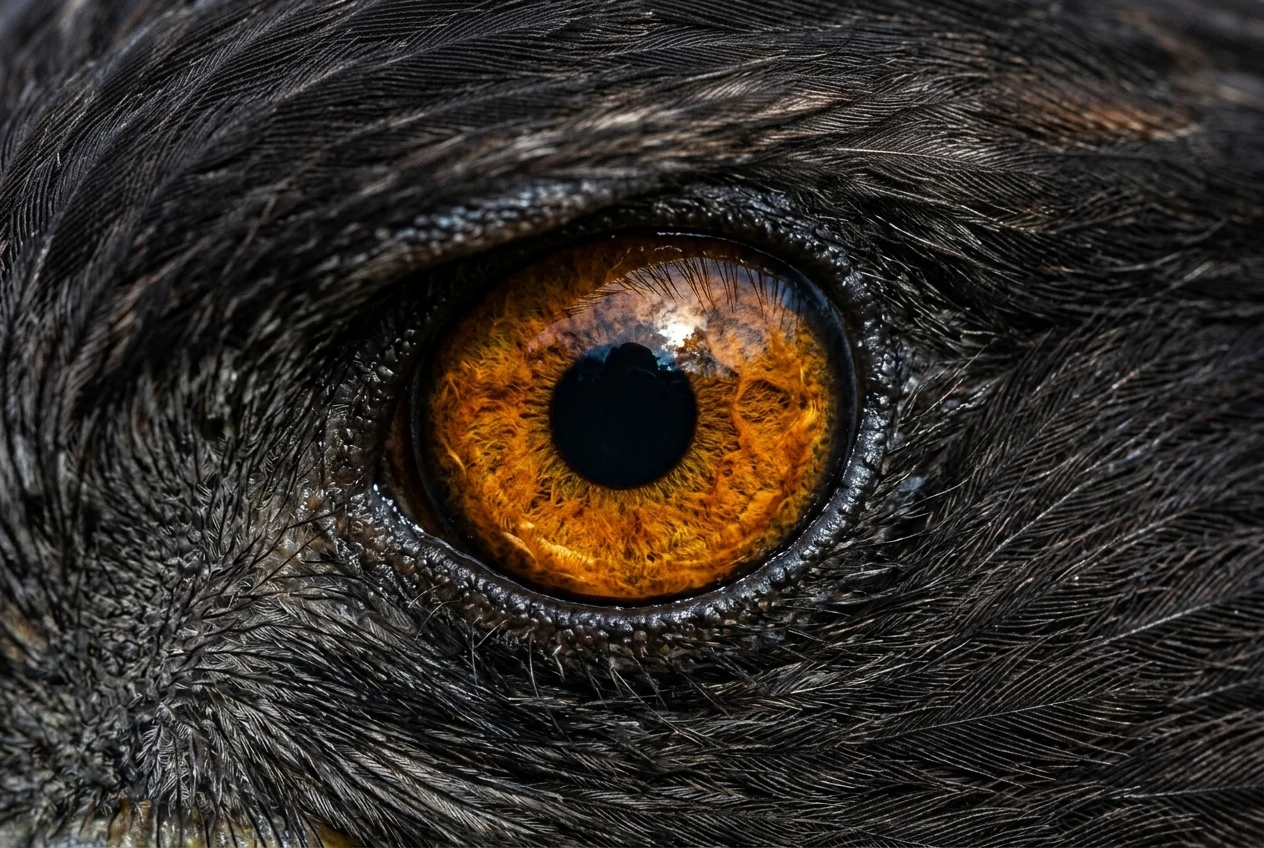
The eye is where a viewer looks first, and in monochrome it is the easiest part to lose.
A dark eye in a dark face disappears unless there is an eye ring, a pale lore, or a catchlight to define it. A pale iris, like the yellow of many owls and raptors, converts to a light tone around a black pupil and gives an intense stare.
Colour filters in conversion can strengthen or weaken that effect, which is covered below.
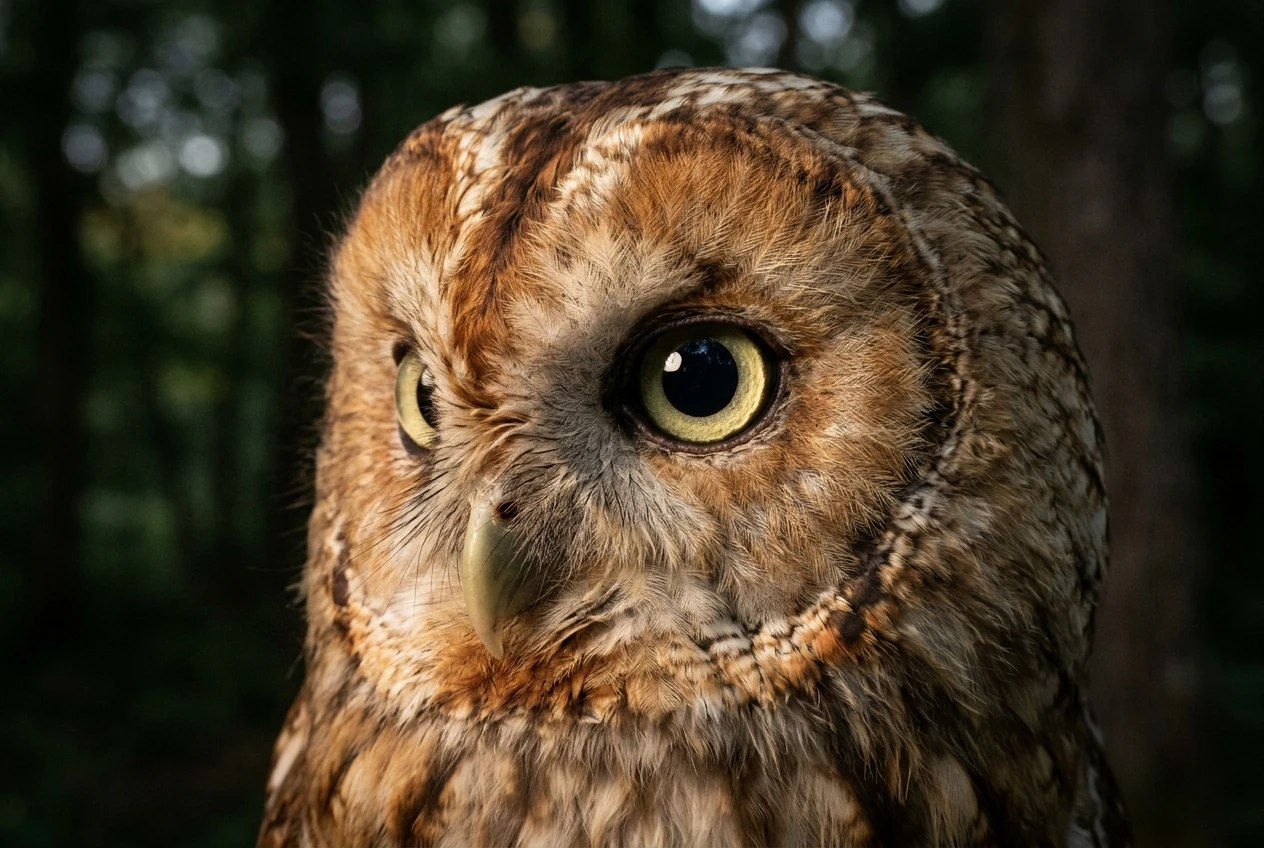
Shadow also matters.
High overhead light drops a shadow into the eye socket, and the eye turns into a black hole with no catchlight.
The beak and bare parts
Yellow, orange and red beaks and legs usually convert to light or mid tones.
A pale beak against a dark head makes a strong anchor point.
A dark beak against dark plumage merges with it and can cost you the profile that gives the bird its shape.
Look at where the beak sits against the face and what is behind it.
A previsualisation checklist
Run through these before you press the shutter:
- Does the bird have at least two distinct tonal zones I can see without colour?
- Is the eye separated from the surrounding feathers by tone, an eye ring or a catchlight?
- Where does the light come from, and does it reveal feather texture or flatten it?
- Are the brightest feathers (white, or the sunlit edge of pale plumage) safely within the exposure range?
- Is the background clearly lighter or darker than the bird’s head and body?
- Will any red, orange or green in the scene convert to the same grey as the bird?
If you answer no to two or three, shoot it in colour and move on.
Light direction and quality that give a portrait its character in mono
Without colour, the light carries the mood.
The same bird looks gentle, severe or sculptural depending on where the light falls.
For a broader look at how light behaves in bird photography, see our piece on the importance of light in bird photography.
Side light is the most reliable choice for monochrome portraits. Light arriving from roughly 45 to 90 degrees to the camera axis grazes the feathers, casting tiny shadows that show texture and roundness.
The head turns from a flat disc into a form with a bright side, a shadow side and a gradient between them.
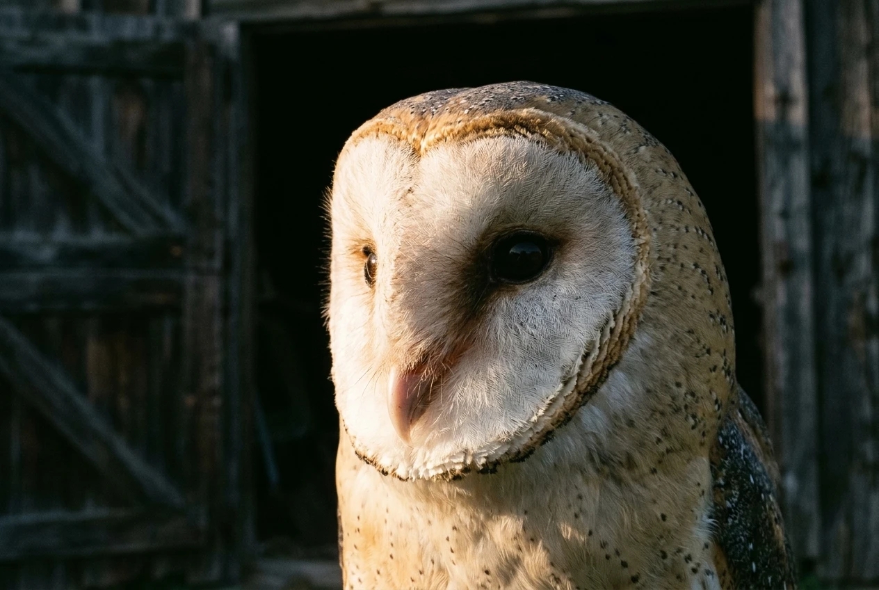
Front light is acceptable for birds with strong patterns, but it removes the shadows that describe form. On a plain bird it produces a flat grey image.
Backlight and rim light can outline translucent feather edges with a bright line, which separates the bird from a dark background very effectively. The risk is that the face falls into shadow and the eye is lost. Exposure for the rim and a gentle lift in the face during editing is the usual compromise.
Soft, overcast light compresses contrast. That suits white and pale birds, because it keeps the whites from clipping, and it suits quiet, low-key portraits. A bird with little tonal variation of its own will look dull in it, though, and you will need to add contrast in editing, which also magnifies noise.
Hard sun produces the deepest blacks and brightest whites. On a bird with dark plumage the shadows can block up and lose all feather detail. On a bird with a bold pattern it can be dramatic. Low sun early or late in the day gives hard light with a long angle, which is much more flattering than midday sun from above.
Exposure choices that protect highlight detail in white and dark plumage
Monochrome conversion stretches contrast, and any highlight that clipped in the capture cannot be recovered afterwards.
Treat highlight protection as the priority, then check the shadows.
White and pale plumage
White feathers carry their detail in a narrow band of tones just below pure white. Once those clip, the feather turns into a featureless patch.
To protect them:
- Switch on the highlight warning or zebras and watch the brightest plumage, not the whole frame.
- Use negative exposure compensation when a small white bird sits against a dark background, because the meter tries to brighten the dark surroundings and overexposes the bird.
- Shoot RAW. The raw file holds more highlight information than the in-camera JPEG preview suggests, and the camera’s histogram is usually based on that JPEG preview.
Dark and black plumage
Black feathers have texture that is easy to lose.
If you underexpose them, the detail sits close to the noise floor, and lifting it in editing brings out noise and colour blotches.
Exposing as bright as the highlights allow, then bringing the exposure down in editing, keeps the dark feathers cleaner.
Be careful with a mixed bird such as a white-breasted, black-backed species: the white sets the limit, and the black has to take whatever is left.
Using a monochrome preview
Many cameras let you set a monochrome picture style that shows black and white in the viewfinder while still recording a full-colour RAW file.
This makes it easier to judge tonal separation while you shoot.
Check how your camera’s histogram behaves in this mode, because some models base it on the monochrome JPEG and some on the raw data.
Controlling the background so the bird separates by tone alone
In colour, a distracting background can be forgiven because hue difference still separates the bird.
In monochrome, the background and the bird have to differ in tone, or the bird disappears.
Our guide on creating depth in black and white bird photography covers how to build layers and distance.
For the portrait itself, the decision is simpler: pick a background that is clearly lighter or clearly darker than the bird’s head.
- Pale bird, dark background. A bird in sunlight in front of a shaded tree line or dark water gives strong separation. This is the classic high-contrast monochrome portrait.
- Dark bird, light background. A crow or cormorant against bright sky, pale water or a pale out-of-focus field stands out as a silhouette-like form. Expose so that the bird’s feather detail is still present, since the bright background will push the meter towards underexposing the bird.
- Mid-tone bird, mid-tone background. This is the combination to avoid. If you cannot change the background, change your position.
Moving a metre or two to the side often changes what sits behind the bird completely.
Lower angles shift the background from clutter to distant, evenly toned water or ground.
Look at the background and ask whether it would be a lighter or darker grey than the head, and whether the two are visibly different.
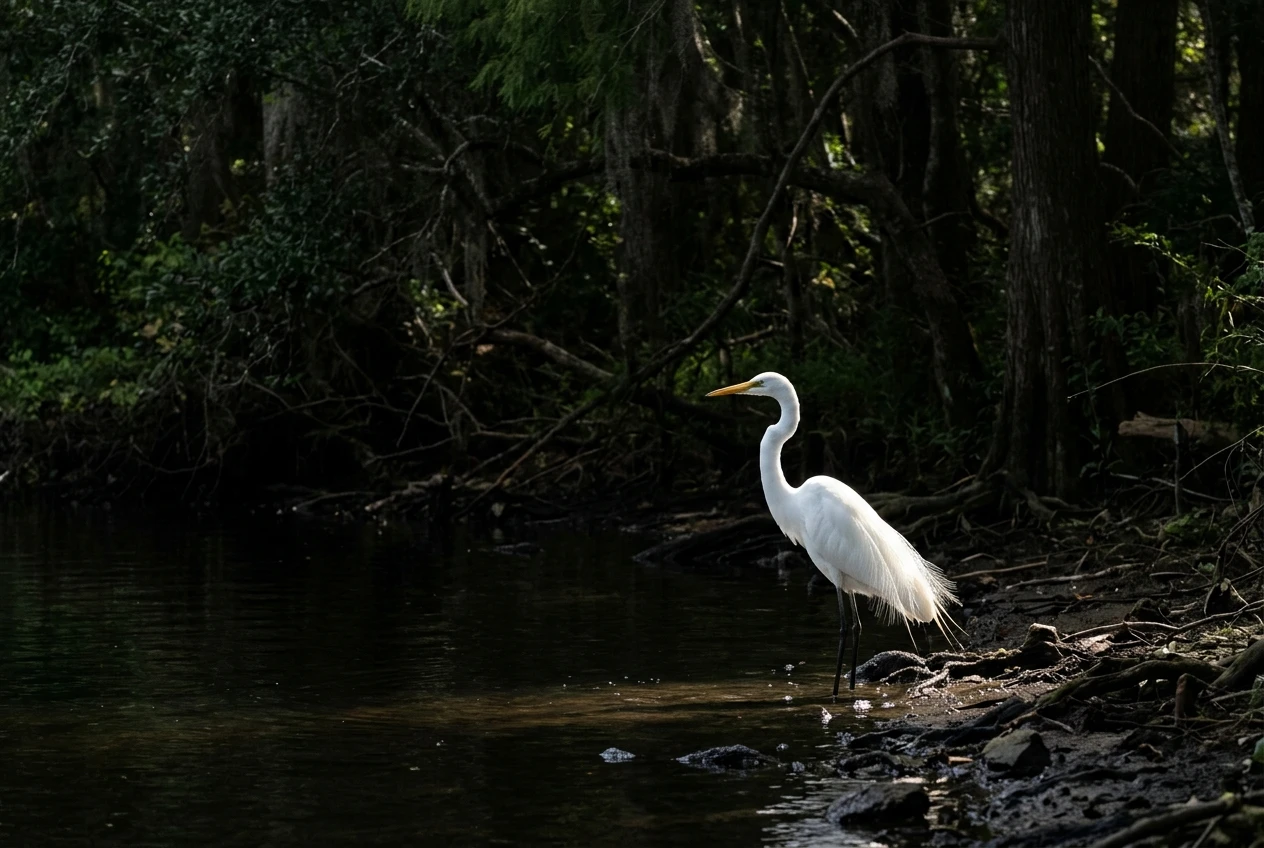
A bright patch behind or near the bird pulls attention in monochrome even more than in colour.
You can reduce this in editing with a local darkening mask, but it is easier to avoid at the time.
Converting in RAW: channel mixing, local contrast and keeping the catchlight alive
Start from a neutral colour RAW, with correct exposure and white balance.
Avoid using a one-click black and white preset as the final step, because presets apply the same colour response to every image.
Channel mixing
Most RAW editors have a black and white mix with a slider for each colour channel.
The sliders change how bright each colour becomes in grey.
Raising the orange and yellow sliders lightens rusty plumage, amber eyes and yellow beaks. Lowering the blue slider darkens a blue sky or a blue-backed bird.
Lowering green darkens foliage, which can push a green background away from a pale bird.
Use these to build the separation you planned in your tonal map. If a rufous bird merges with a brown background, move the orange slider and the background’s slider in opposite directions until the two grey values differ.
Global tone, then local work
Set the overall tonal range first: white point just under clipping, black point where the darkest areas still show detail. Then work locally with masks:
- Lift the eye region slightly, or darken the surrounding feathers, so the eye holds attention.
- Darken distracting bright patches in the background.
- Add a little brightness to the lit edge of the head or breast to reinforce the direction of the light.
Local contrast tools such as texture and clarity make feathers appear crisper.
Apply them with a mask to the bird only and at modest strength, because high settings produce halos along edges and make noise look rough in the sky and background.
Keeping the catchlight alive
The catchlight is a small, bright reflection that makes the eye look alive.
It is easy to damage in monochrome processing: a heavy dark vignette, a darkening brush near the eye, or a high-contrast curve can dull it.
Zoom to 100 percent, check that the catchlight is still the brightest point in the eye, and mask any adjustments so that they leave it alone.
If there was no catchlight in the original, a very small, soft brightening of the eye can help, but it should be barely noticeable.
Grain, tonal curve and print output for a finished portrait
Tonal curve
A gentle S-shaped curve adds contrast in the midtones while keeping the extremes under control.
Resist pushing it far enough to crush the blacks or clip the whites.
Detail in the darkest feathers and the brightest highlights is often what separates a technical print from one that holds interest at close range.
Grain
Noise from a high ISO sensor is colour speckle, and it looks harsh in black and white.
Apply noise reduction before conversion, and then add grain deliberately if you want texture. Film-style grain is more even and less distracting than sensor noise.
Add it after you have set the final size and applied sharpening, since resizing changes grain appearance.
Smaller amounts suit large prints viewed from a distance, and slightly more can suit small prints.
Print output
A screen can show deeper blacks and brighter whites than paper can.
Soft-proof the image using the profile of your printer and paper, and adjust until the shadows still show feather detail and the highlights stay slightly off the paper white.
Matte and fine art papers give soft, low-reflection tones. Glossy and lustre papers give higher contrast and deeper blacks but show reflections.
Choose the paper after you have decided on the character of the portrait.
Export at the dimensions your print lab or printer recommends, and sharpen for output as the final step.
Try it on one of your own images
Pick one portrait from your own archive, previsualise its tonal map using the checklist in this article, then convert it and compare it with the colour original.
Pay attention to where the eye sits, which tones separate the bird from the background, and whether the light is revealing the feathers or flattening them.
When you are ready to think about the equipment side, read our guide to choosing the right lens for black and white bird photography.