
A flat raw file is the expected starting point.
Raw data has no tone curve applied, and the rear-screen preview is a JPEG rendering with the camera’s own contrast and saturation baked in.
When you open the raw in an editor, you see a neutral rendering with that styling removed. All the tonal information is in the file, and the edit is where you decide how it is distributed.
This guide covers how to edit bird photos for high contrast while keeping feather structure intact, in colour, from raw file to print-ready output. It does not cover conversion to monochrome.
For that, see why some birds work in black and white and others fall flat.
Why a flat raw file is not a bad file, and what contrast actually means for plumage
Contrast in a bird photograph operates at three scales, and most editing mistakes come from confusing them.
- Global contrast is the spread between the darkest and brightest tones in the frame. It determines whether the image looks punchy or muted at a glance.
- Subject-to-background contrast is the tonal and colour difference between the bird and what surrounds it. It determines whether the bird separates from the scene.
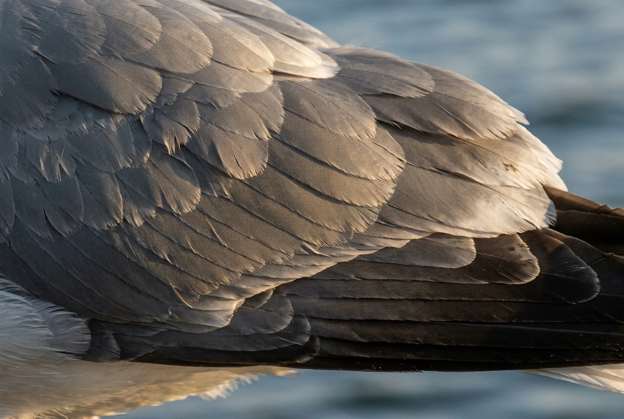
- Micro-contrast is the small tonal difference between neighbouring feather barbs, the shadow between overlapping coverts, and the edge of a primary against the one beneath it. It determines whether plumage looks like feathers or like a smooth painted surface.
A heavy-handed contrast boost raises the first at the expense of the third.
Pushing the global slider moves bright feathers toward white and dark feathers toward black, and both ends lose the tiny gradations that describe the barbs.
The aim of the workflow below is to raise global and subject contrast while leaving the midtone gradations in the plumage as intact as possible.
Starting material matters too.
Light with direction and a clear shadow side gives you tonal separation to build on, and flat overcast light gives you less.
The site’s piece on the importance of light in bird photography covers that side of the problem.
Set the foundation first: exposure, white balance and lens corrections before any contrast work
Contrast edits layered on a poorly balanced file amplify the errors. Do these four things first, in this order.
Exposure
Set overall exposure so the brightest feathers that should hold detail sit just below clipping, and judge by the bird rather than the sky.
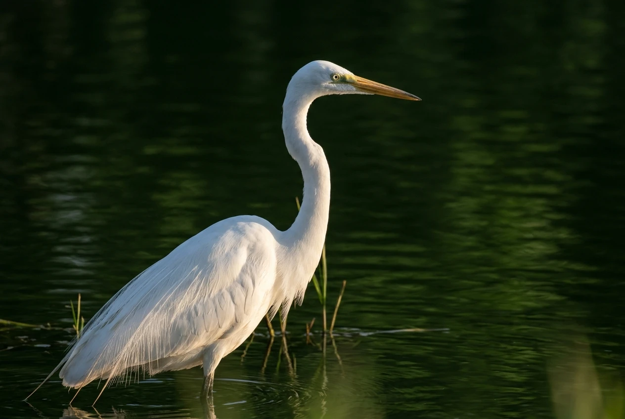
A white egret, a gull’s mantle or a swan’s chest will be the first areas to lose texture.
Pull exposure down until the clipping warning disappears from those feathers, then recover brightness later with the curve, where you control how highlights roll off.
A raw file generally holds more highlight information than the preview histogram suggests, because the histogram is calculated from the rendered preview and not from the raw data.
A warning that shows on screen may be recoverable by lowering highlights or exposure.
Test it rather than assuming it is lost.
White balance
A colour cast reduces perceived contrast, particularly in the mid-tones, and it becomes more obvious once you steepen the curve.
Use the eyedropper on something truly neutral if the scene offers it, such as white plumage in even light, a grey rock or a cloud.
Do not neutralise the whole image blindly: warm light at sunrise is part of the picture, and removing it entirely will flatten the mood you want to keep.
Set white balance so whites and greys read as neutral relative to the light, then adjust the temperature slightly toward the feel you want.
Lens corrections
Enable the lens profile correction for your lens and camera body.
Vignetting correction evens out the corners so the vignette you add later is deliberate.
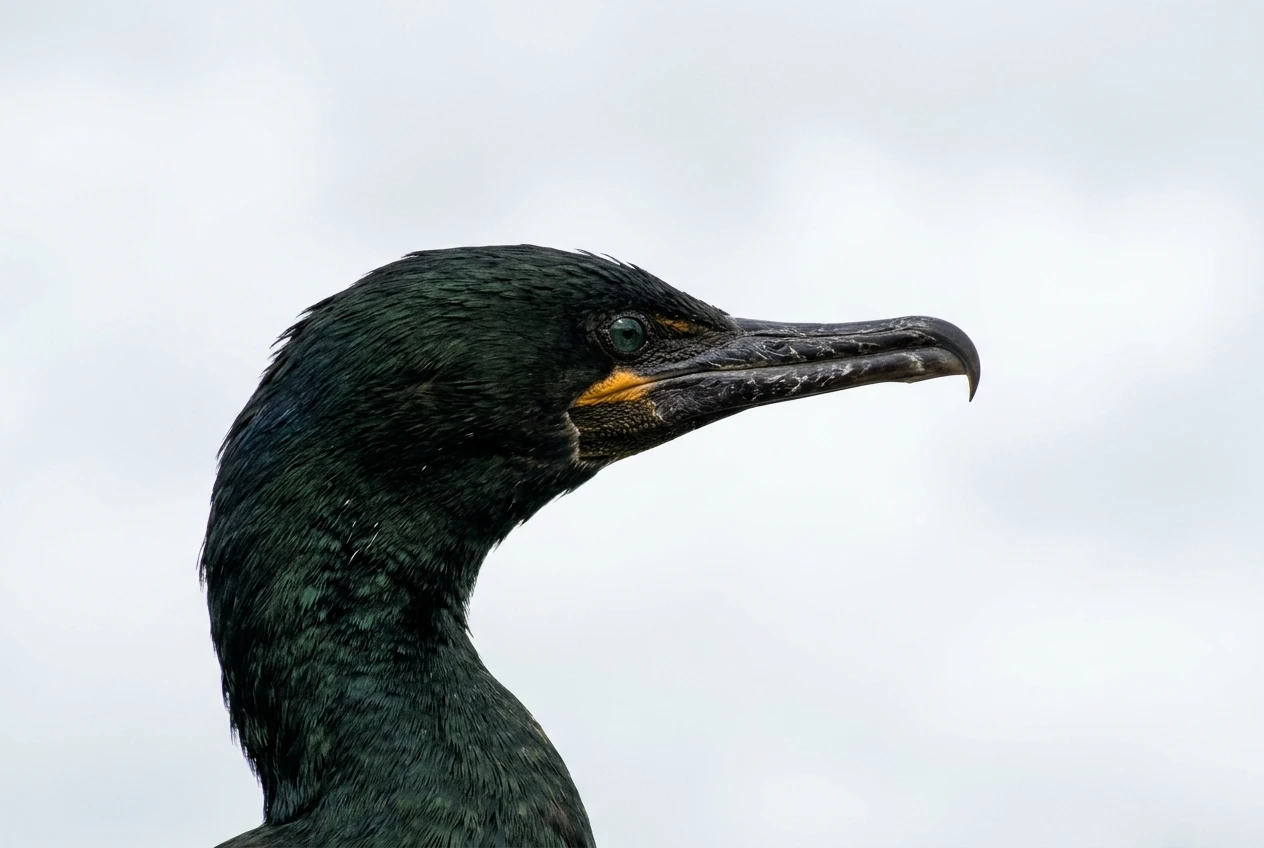
Distortion matters little for birds, but chromatic aberration matters a great deal: it produces purple and green fringes along high-contrast edges, such as a dark bill against a pale sky or a wing edge against bright water.
Contrast edits make these fringes more visible, so remove them first with the profile and the defringe or CA removal control.
Crop and straighten
Crop before local edits, since masks and vignettes depend on the final frame.
Leave a little room around the bird if you intend to print at a standard ratio, because trimming for a print format later can cut into the composition.
Shape the tone curve instead of dragging the Contrast slider
The Contrast slider applies a fixed S-shaped adjustment pivoting around mid-grey.
It affects every tone with the same shape, whether or not that shape suits the bird in front of you.
A dark-plumaged bird in bright light and a pale bird in shade need different curves, and the slider cannot tell them apart.
The point curve gives you the same S-shape with control over where it bends.
A workable approach:
- Set an anchor point at the middle of the curve so mid-grey stays where it is.
- Add a second point in the shadow quarter and pull it down slightly to deepen the darks.
- Add a third point in the highlight quarter and lift it slightly to brighten the lights.
- Check the ends. If the curve steepens sharply near the top right, bright feathers will clip long before the highlight end of the histogram reaches the edge. Keep the highlight end of the curve gently sloped so tones compress gradually.
Small moves work better than large ones.
A curve whose steepest section sits through the midtones gives you the most contrast where the plumage detail lives, so a steep curve there will also raise micro-contrast, which suits feathers up to a point.
Past that point, adjacent barbs start to separate into hard light and dark patches.
If a feather texture starts to look gritty or posterised, the midtone section is too steep.
A caution on colour: in many editors, an RGB curve applied to all channels also raises saturation as it raises contrast, because each channel is stretched independently.
On a bird with strong reds or oranges this can push colours out of range.
If your software offers a luminosity blend mode for the curve (Photoshop does on a Curves adjustment layer), use it so the curve changes brightness without altering colour.
Otherwise, reduce saturation or vibrance slightly after the curve and check that saturated feathers keep their texture.
Use the Highlights and Shadows sliders alongside the curve rather than instead of it.
A reasonable split: let the curve set the overall shape, then use Highlights to pull back bright feather areas that the curve pushed too far, and Shadows to open dark plumage so the curve’s deeper darks do not swallow it.
Separate the bird from the background with masks, and darken or lighten each on its own terms
Global edits treat the bird and the scene as one thing.
They are not.
A bird often needs more brightness and local contrast than its background, and the background often needs to be quieter. Masking lets you set each independently.
Most current editors offer an automatic subject selection.
Use it as a starting point, then check the edge.
Automatic masks are generally reliable on the body but can miss fine detail such as wispy crest feathers, a fluffed-up chest edge or the tips of long tail feathers.
Zoom to 100 percent, view the mask overlay and correct the edge with a brush set to subtract or add.
Then invert the mask to select the background.
On the background:
- Lower exposure slightly, in the range of a third to two thirds of a stop, to push the bird forward without making the background look black.
- Pull down highlights in bright patches, such as sky behind branches or sun glints on water, since these draw the eye away from the bird.
- Reduce saturation or luminance of colours that compete with the plumage, such as a bright green leaf behind a green-toned bird.
On the bird:
- Add a small amount of exposure, or lift the whites, so the bird is the brightest element of the frame.
- Add local contrast with a modest texture or clarity setting. Apply it to the bird mask only, because the same setting on out-of-focus background reads as noise.
- Brush a small, soft exposure increase over the eye if it is dark and lacking a catchlight. Keep it small: an over-brightened eye looks artificial.
Mask edges cause most of the visible damage in this stage.
If the background is darkened and the mask edge is too tight, a pale halo appears around the bird. If the edge is too loose, the background darkening bleeds onto the outer feathers.
Feather the mask by a few pixels and re-check at 100 percent.
A halo is easier to see at a different zoom level and on a different display than the one you edited on, so look at it at both a fit-to-screen view and a 100 percent view before moving on.
Colour contrast works alongside tonal contrast.
A warm-toned bird against a cool background separates more strongly than the same bird against a similar hue, even at the same brightness.
A small temperature shift applied to the background mask alone can strengthen separation without touching the bird’s colours.
Protect feather detail: reading the histogram and clipping warnings in highlights and shadows
The histogram and the clipping overlays are the check on everything above. Read them with the following in mind.
The luminance histogram can look fine while a colour channel clips. Saturated plumage such as a cardinal’s red, a kingfisher’s orange or a roller’s blue can saturate one channel while overall brightness looks safe. The result is feathers that look flat and textureless in one colour.
Look at the individual red, green and blue channels, or the editor’s per-channel clipping warning, when the bird has strongly saturated areas.
The clipping warning shows the preview, not the file. As with exposure, check whether a flagged area responds to a small reduction in highlights or whites.
If it does, the detail was there.
White birds need a different test than the warning. Pure white plumage in bright light can show clipping on the overlay even when it has visible structure. Zoom in on the flagged feathers: if you can still see the shadow lines between feathers, the area is fine. If it is a flat white patch, pull back.
Dark plumage loses detail in the shadows, not at the black point. A cormorant, crow or black-plumaged grackle may have a histogram that looks acceptable, with detail trapped in the bottom few percent.
Raise the shadows slightly in the bird’s mask and check the barbs along the back and wing. A small lift gives you structure to work with, and the curve can then deepen the overall darks again.
Two limits help keep this under control.
Do not let the black point sit so low that dark feather areas merge into each other, and do not let the white point reach the maximum for any feather that should show structure.
Both limits matter more once you print, because paper reproduces a narrower tonal range than a display does, so tones that were close together on screen may merge on paper.
The soft proof step below checks for this.
Sharpening and noise reduction that suit a high-contrast look, and where they go wrong
High-contrast edits make noise and sharpening artefacts more visible.
A steeper curve stretches the shadow tones, which amplifies luminance and colour noise.
Sharpening increases edge contrast, which on a high-contrast image can produce visible halos around the bird.
Noise reduction goes first, before sharpening.
- Apply colour noise reduction at a level that removes colour speckle without desaturating small coloured areas such as a bill or eye ring.
- Apply luminance noise reduction in proportion to the ISO. Over-applying it smooths feather texture into a plastic surface, which undoes the work of protecting micro-contrast. Where the bird is sharp and the background is smooth, apply stronger reduction to the background mask and lighter reduction to the bird.
- Check the shadow areas at 100 percent, since the curve will have amplified noise there.
- If your editor has an AI-based denoise, treat its output as a separate version of the file and compare it to the original at 100 percent. These tools can smooth fine feather structure along with the noise.
Capture sharpening compensates for the softness the sensor and lens introduce.
Use the editor’s masking control, which restricts sharpening to edges, and raise it until smooth areas such as out-of-focus background stop receiving sharpening.
Most editors let you hold Alt or Option while moving the masking slider to see which areas are affected. If the background shows white patches in that view, it is being sharpened, and that sharpening will read as grain.
Where it goes wrong:
- Halos. A bright outline appears along a dark bird’s edge against a bright sky. Reduce the sharpening amount or radius, or reduce sharpening on the edge using the mask.
- Crunchy feather texture. Fine barbs look etched rather than soft. This is over-sharpening combined with a steep midtone curve. Reduce one or both.
- Amplified noise in the shadows. Sharpening lifts noise in dark areas that the curve has already stretched. Use the shadow-protecting option in the masking control, or sharpen through a luminosity mask that excludes the darkest tones.
Prepare for print: soft proofing, output sharpening and checking the file on paper before you commit
A display emits light and paper reflects it, so a file that looks right on screen will usually look different on paper.
Prepare for that before you send anything out.
Soft proofing. Download the ICC profile for the specific paper and printer combination you will use, which most paper manufacturers and print labs provide.
Load it as the soft-proof profile in your editor. The screen preview then simulates how the paper will render the colours and tones.
Two settings matter:
- Rendering intent. Perceptual compresses the whole colour range to fit the paper and tends to preserve relationships between colours. Relative colorimetric preserves in-gamut colours exactly and clips only the ones outside the paper’s range. Try both and compare. Use black point compensation with relative colorimetric.
- Gamut warning. Turn it on to see which colours fall outside the paper’s range. Saturated feathers such as blues and oranges are common offenders.
Compare the proof to the original.
Expect the proof to look duller and flatter, particularly in the shadows and the most saturated areas.
Adjust on a proof copy: lift the deepest shadows slightly if dark feather detail has merged, and reduce the saturation of out-of-gamut colours. Keep the soft-proof edits as a separate version so the master file stays untouched.
Output sharpening. Sharpen for the output size and the paper, after resizing. Matte paper absorbs ink and softens fine detail, so it generally takes more sharpening than gloss.
Most editors offer low, standard and high output sharpening by paper type in the export or print dialogue, and that is a sound starting point.
The file looks over-sharpened on screen at 100 percent when sharpened correctly for print, so judge it on paper and not on the monitor.
Resolution. Set the file to the print’s dimensions at a resolution your lab recommends. Many labs ask for 240 to 300 pixels per inch. Check their requirements, since they differ.
Check on paper before you commit. A test print at a small size shows what the screen cannot: whether the shadows hold detail, whether the highlights keep their texture, and whether the colours match the proof.
Compare the print to the screen under the light it will hang in, since a print viewed under warm room lighting and a monitor at a cool white point will not match.
If the print is darker than expected, brighten the proof copy and print again. Order the large print only once the small one passes.
If you want to see how these edits look on paper, browse the Avian Vistas prints.
And if you want files with more tonal latitude to start from, the guides to the best cameras for bird photography and the best lenses for bird photography cover what to look for in a body and glass.